Heartwood
A design system to propel Spruce Labs’s mission to define the future of brick and mortar retail.
The Brief
Spruce Labs's mission is to help brick and mortar retailers thrive by enabling them to create great experiences. From day one, Spruce has found success by combining technology with a human-centered approach to experience management.
Spruce evolved for years without any real design direction. We created a small library of components early on, but it hadn't changed since. As a result, component availability became the driver of experience design. This created an experience that felt wonky and awkward.
My goal with Heartwood was to create a shared design language to help our team improve Spruce. I decided early on that this would be more than a component library. We needed a tool, or a set of tools, that would scale with the product.
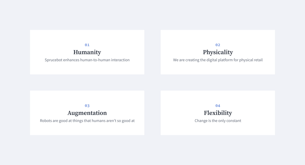
Defining our Design Principles
Before getting into visual styles or components, we defined our design principles. These would serve as stimulus for all future design decisions.
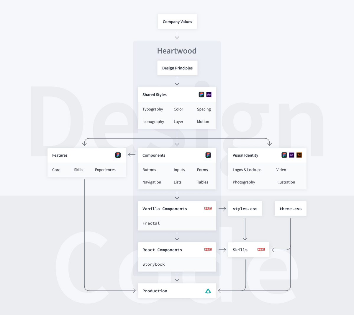
System Architecture
The next step was to determine Heartwood's system architecture. The last thing we wanted was to create a pretty design system that never gets implemented. We worked with the engineering team to figure out how we could get Heartwood into place and keep it up to date.
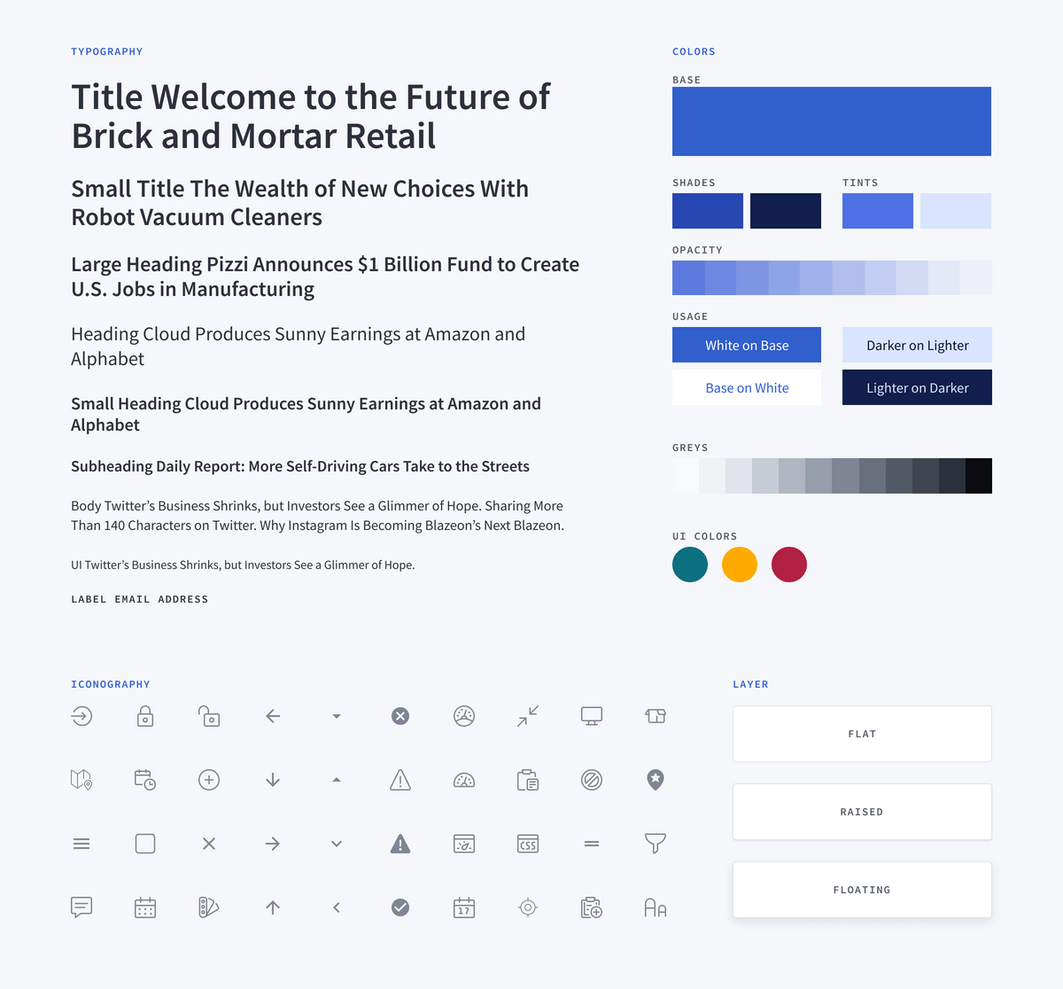
Shared Styles
Using the architecture as a map, the next step was to define shared visual styles. We divided our styles into six main categories: color, typography, spacing, iconography, layer, and motion.
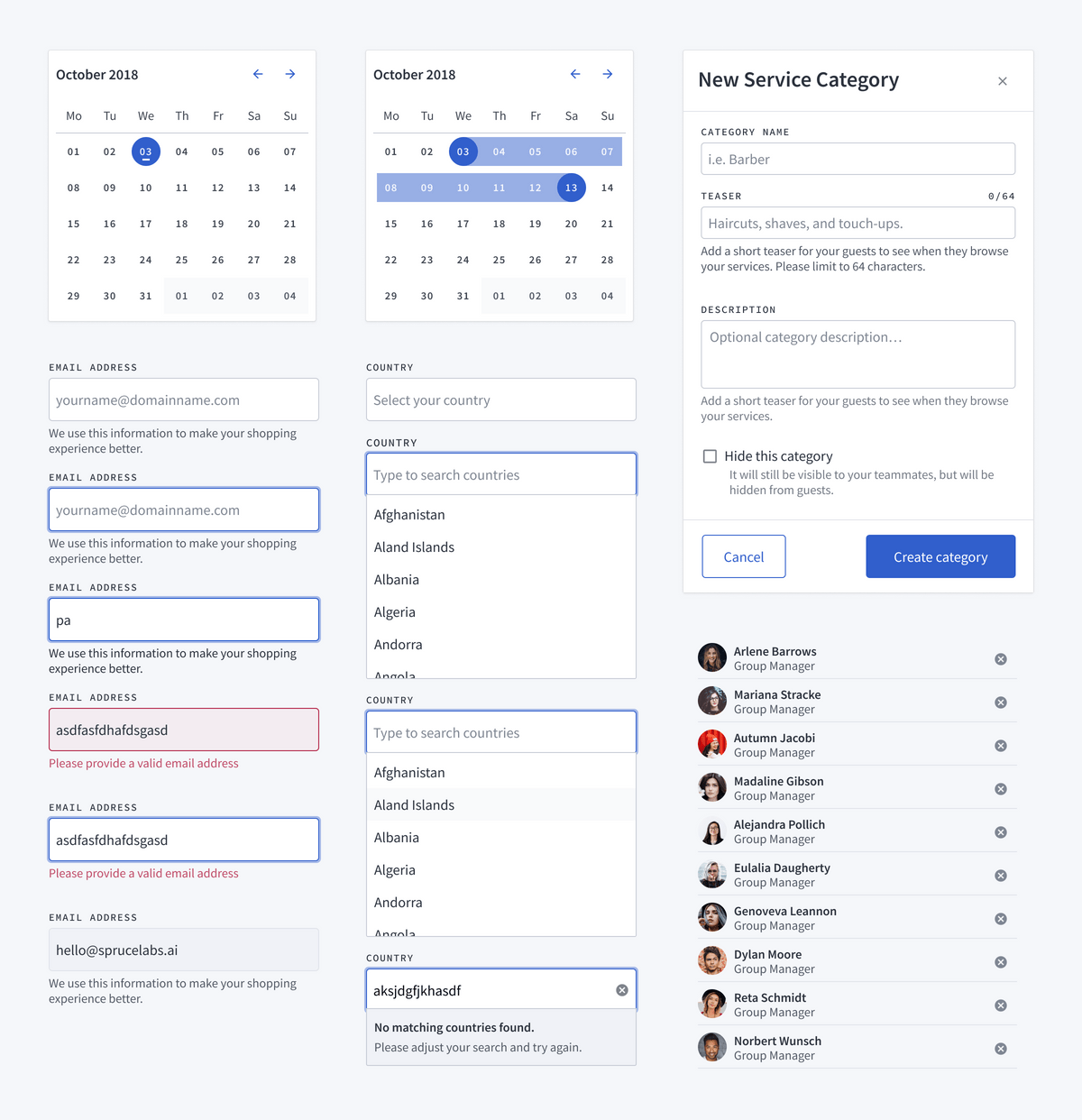
Components
The component design phase began with the humble goal of parity. It was important to make sure we didn't forget to update any existing components. This would let us phase Heartwood into production without breaking anything. To ease the transition, we did a thorough audit of the existing codebase. From this audit, we redesigned each component to use our new shared styles.
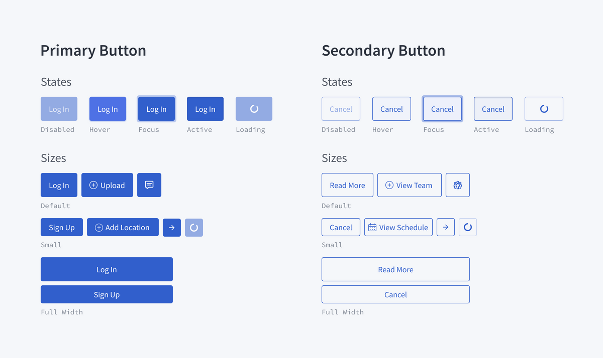
The previous round of component design was lacking in detail. This caused a problem for the design team. To see a component in detail, one would have to look at production, which was often unstable. This situation meant the design team was often blocked from making progress. To solve this problem, we added in-depth details to our design documentation.
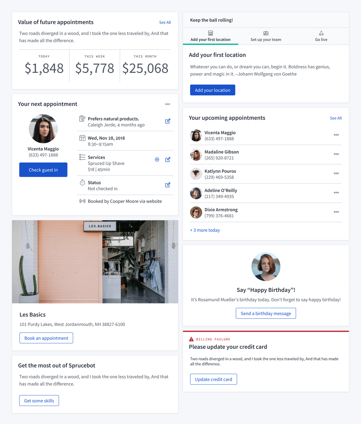
Cards for Humanity
We spent a week or so brainstorming about cards. We focused on what we could use them for, where they would live, and what types of content they'd need to support. Our goal was to invest in a component that would make the platform more flexible.
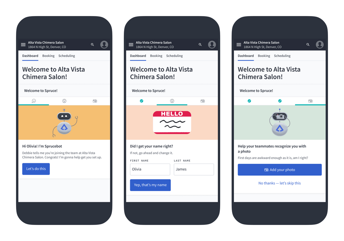
Onboarding
The new card component was a perfect candidate for improving our onboarding experience. We had already considered an onboarding card as one of its use cases. The advantage of having some of the simple design decisions already made was that we were able to focus on the trickier parts of the problem.
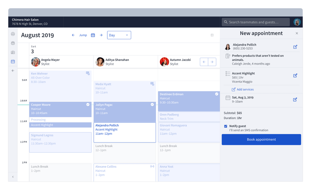
Teammate Booking
The main consideration for teammate booking was to start with a calendar view. On large enough screens, we opted to keep the calendar visible. Desk staff and receptionists tend to use large screens and like to see the whole team's schedule. This view makes it easy for an employee to find an available time and provider.
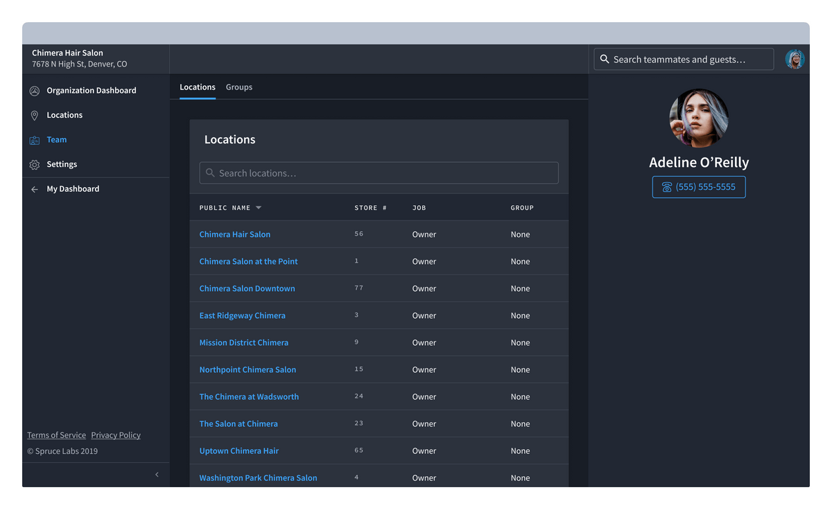
Day/Night Mode
We decided to create “day” and “night” modes to kick the tires on a potential approach to white label theming. The main lift was to define semantic colors, which we could swap out to switch between modes.
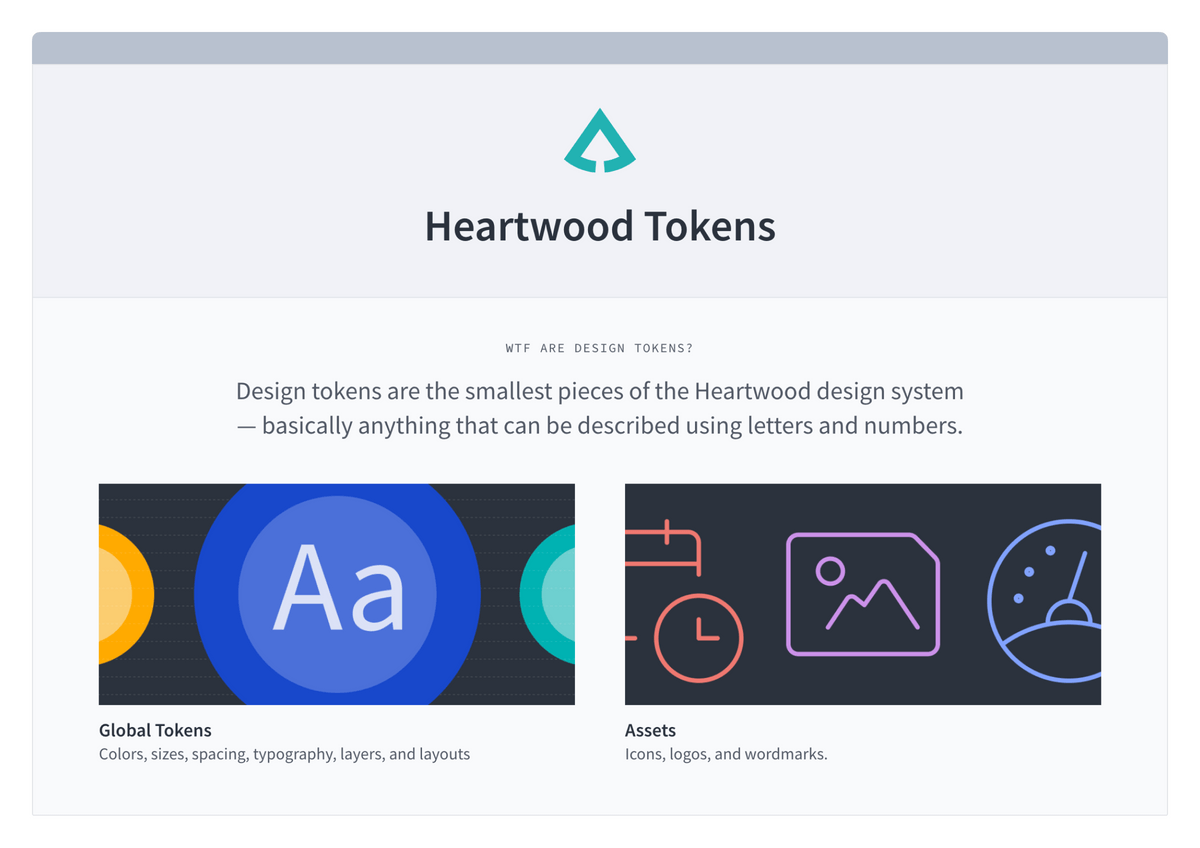
Heartwood Tokens
Explorations in theming led to the development of Heartwood Tokens. We broke these out into a separate project and I created a static website to share with the team. Giving tokens their own home has the added benefit of making Heartwood more scalable. This opened the door to Heartwood evolving into a more robust set of tools with a cohesive foundation.
Results
Heartwood has already gone a long way to make Spruce useful, usable, and beautiful. By providing a shared language, it has equipped the team at Spruce Labs to continue evolving their core product. Heartwood will continue to play a role in defining the future of brick and mortar retail.
