Spruce Labs
Visual identity refresh for an up and coming technology startup.
The Brief
Founded in 2016, Spruce Labs began with the creation of Spruce: an experience management platform for brick and mortar retail. I joined the team in 2018 and after creating the Heartwood design system I shifted focus to the company’s visual identity.
As the product evolved, the previous identity fell out of sync with the company’s design principles. My goal was to bring the two back into alignment.
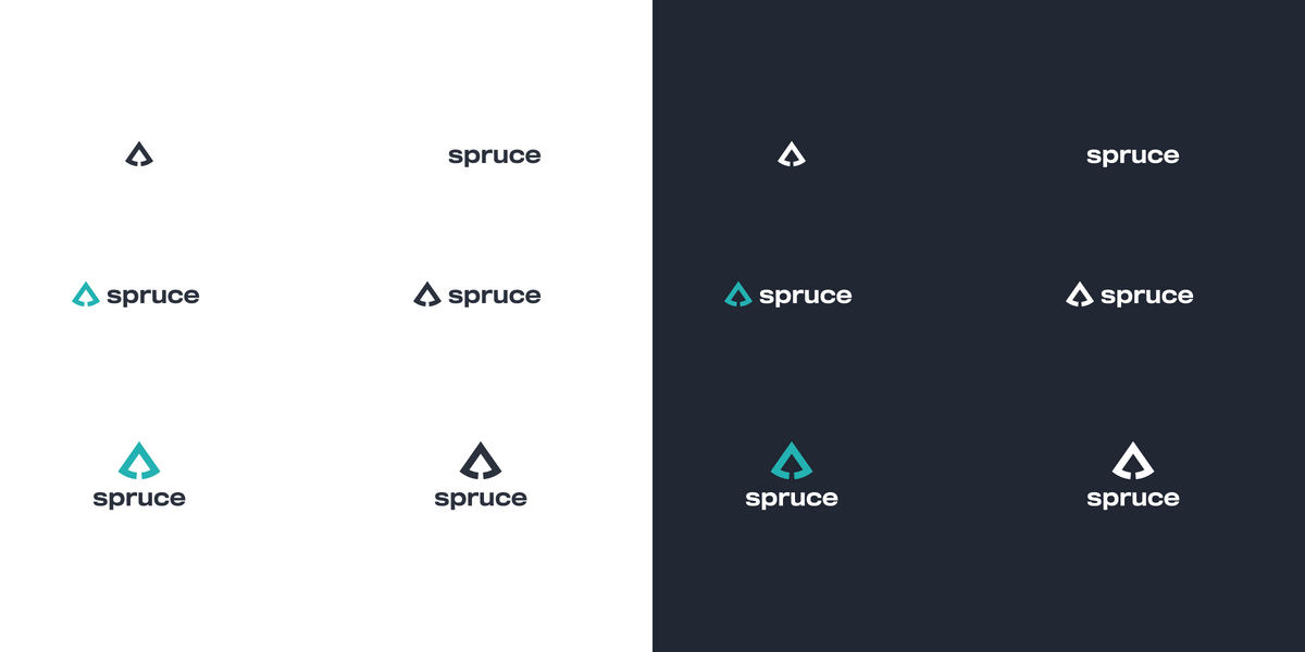
A Smiling Logo
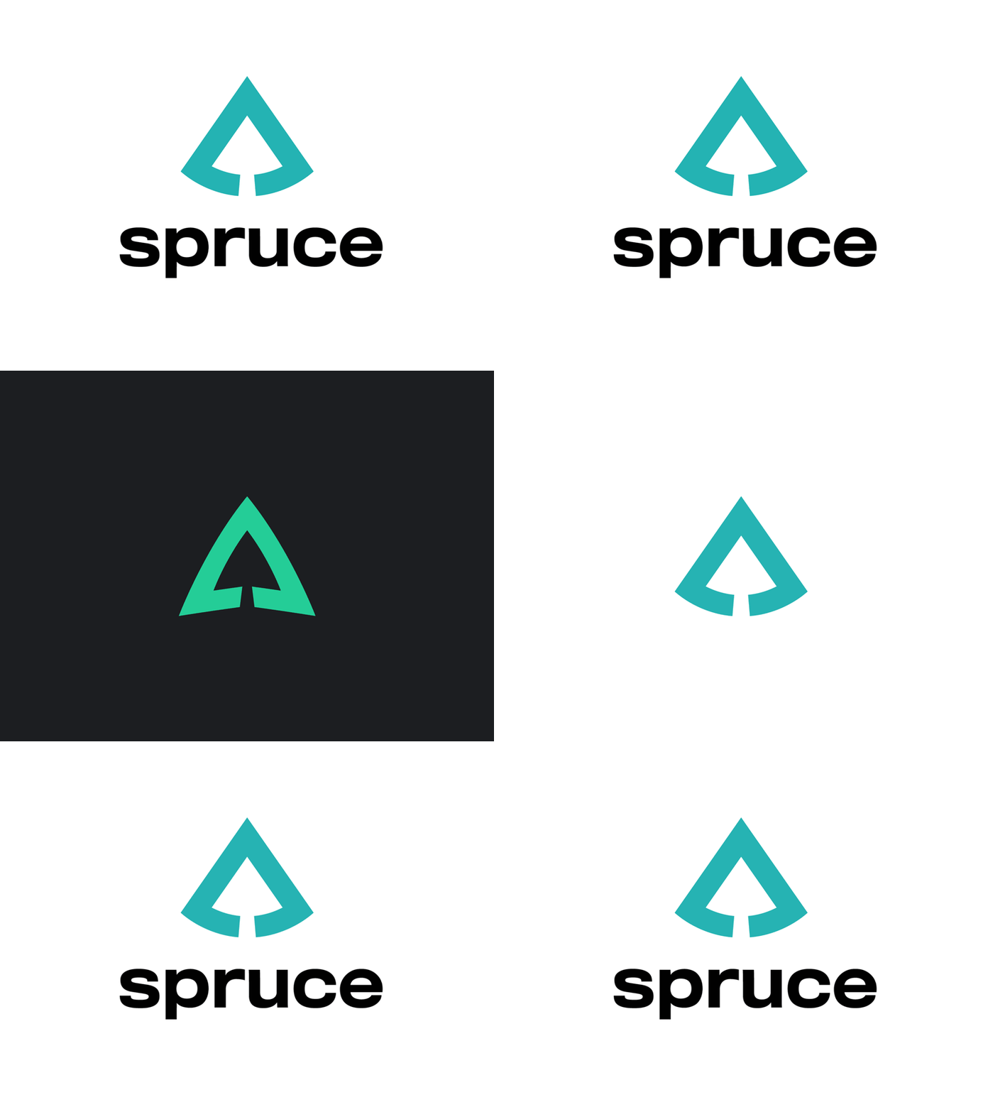
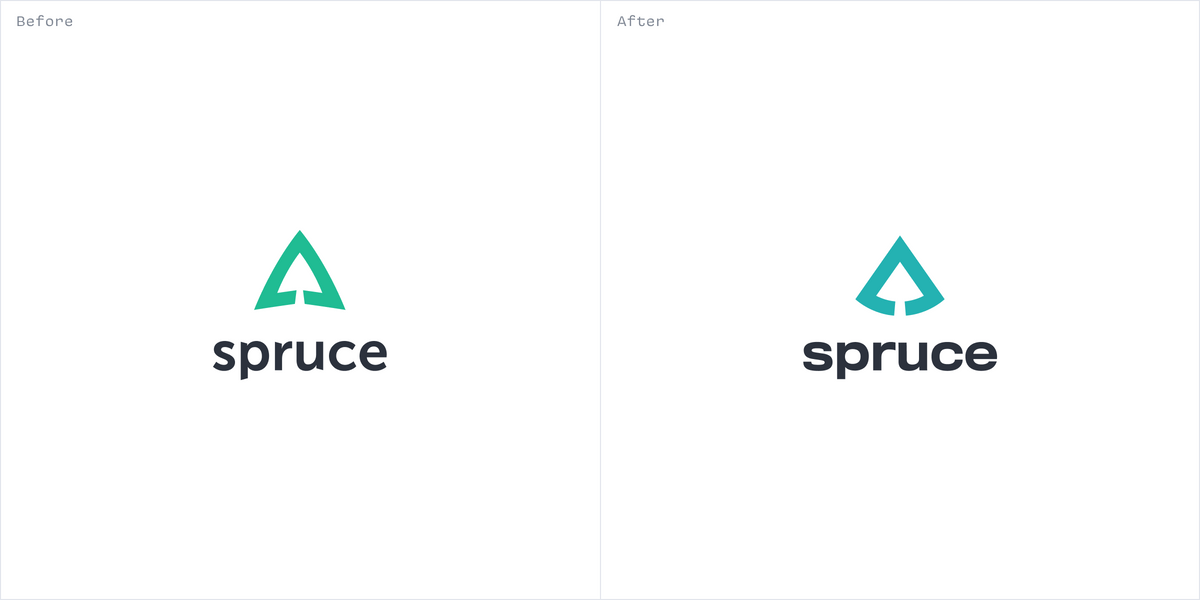
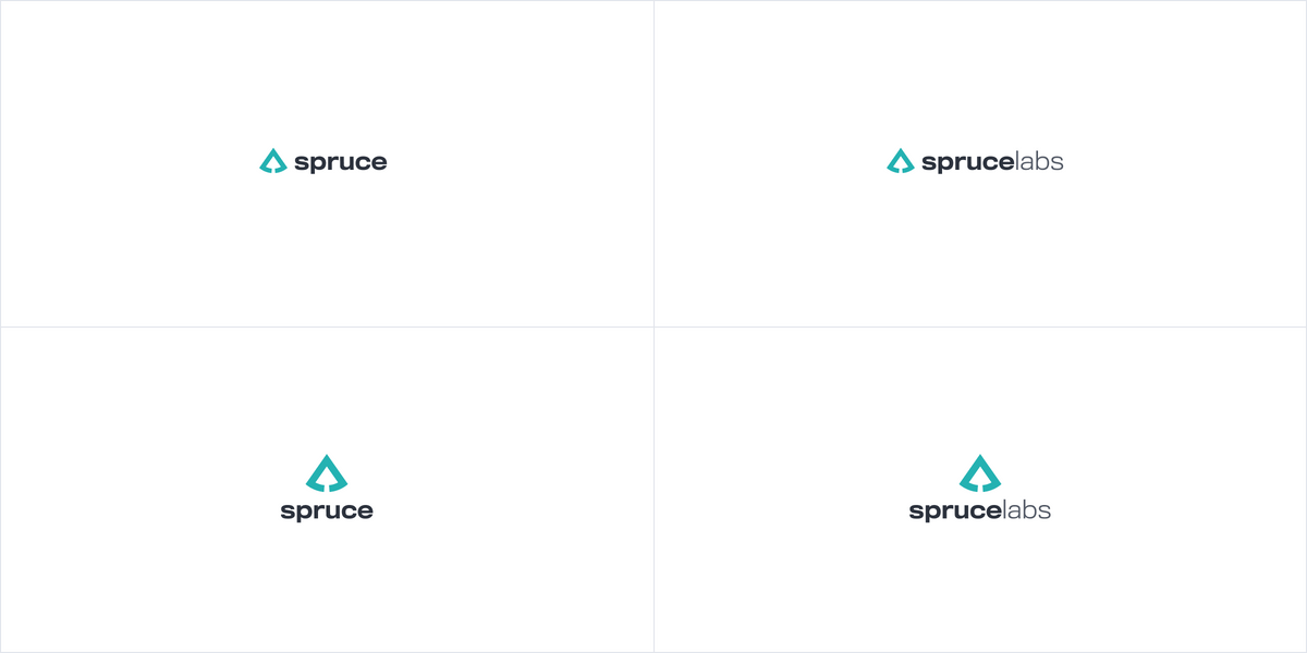
The old logo always felt a bit off, for reasons the team found hard to vocalize. Looking at it through the lens of Heartwood's Humanity principle made it clear. The logo was frowning. The solution was to make it smile.
A More Expansive Color Palette
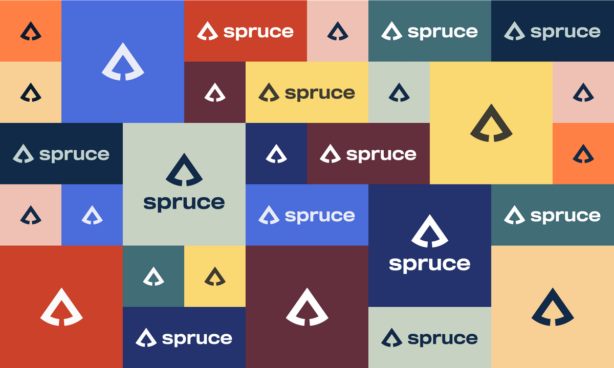
The old color palette was a bit spare when it came to expressiveness. We devised an approach that would focus on how we create contrast, rather than on specific colors. This enabled our creative team to try lots of ideas and push the envelope. At the same time, we had enough parameters to avoid visual chaos.
Bridging the Gap
Illustrations bridge the gap between visual identity and product. We focused on interjecting playful illustrations at moments when a user experiences success

Four Words
I worked with the Engineering team to create a set of lettering pieces to reflect their values. They had chosen four words and chose one to focus on every week.
Results
The refreshed identity has expanded Spruce Labs’s ability to scale as the company grows. As new challenges come into focus, the team will be prepared to meet them.
