DIG Colors
Creating a color system to improve usability and cohesion across Dropbox's brand presence.
The Brief
This project began with a simple objective: to implement platform agnostic tokens in the Dropbox Interface Guidelines (DIG) design system. After kickoff, a number of other compelling opportunities became evident.
The previous iteration of DIG was robust, but missing a couple of key features with regard to color. While the Visual Identity System (VIS) created by Dropbox's Brand Studio provided plenty of options, it fell short in terms of support for accessible color pairings and interactive state handling.
Collaborating with my partners in Brand Studio made it clear that we were solving the same problems in different ways, and we were showing early signs of a breakdown in cohesion. The goal of this project grew to include providing a redefined foundation for our global color system across brand and product.
Starting at the Foundation
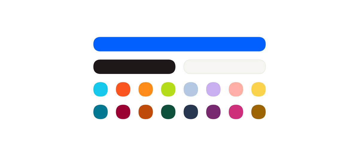
Dropbox's product suite has always been a branded house, rather than a house of brands. This critical distinction underscored the rationale to use the core brand color palette as a firm foundation for new color system.
How Should States Look?
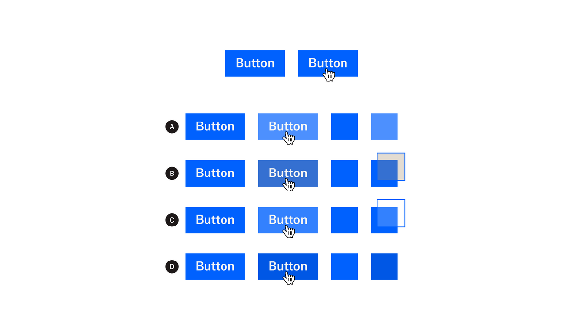
Interactive state support was lacking in VIS. This led to a lot of redundant and slightly different effort to articulate hover and pressed states across the DIG component library. We started to see uncanny differences between components, as well as between logged-out and logged-in surfaces.
Luminance
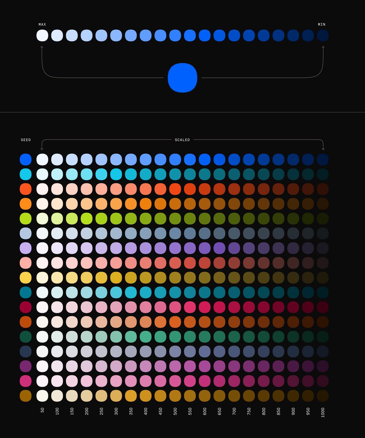
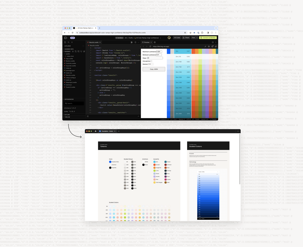
After several rounds of discovery, I landed on luminance as the crux of scaling our color palette. Luminance is the most objective measurement of color contrast. Using this approach provided the highest level of confidence that users would be able to distinguish the colors in our interfaces, regardless of individual color deficiency (i.e. color blindness).
By establishing minimum and maximum luminance targets and a standard set of steps, the DIG color system is able to provide reliably distinguishable color groups. By using core VIS as the foundation, we were able to maintain cohesion without reinventing the wheel.
Prototyping for Scale
Due to the sheer volume of colors we could generate with our luminance-based approach, it was necessary to carefully consider tooling. The solution was to use Chroma JS to generate the color scales. On the design side, I built a custom Figma plugin to import the results as styles (and later variables). On the engineering side, my partners were able to implement identical logic in Storybook for cross-platform compatibility.
Semantic Tokens
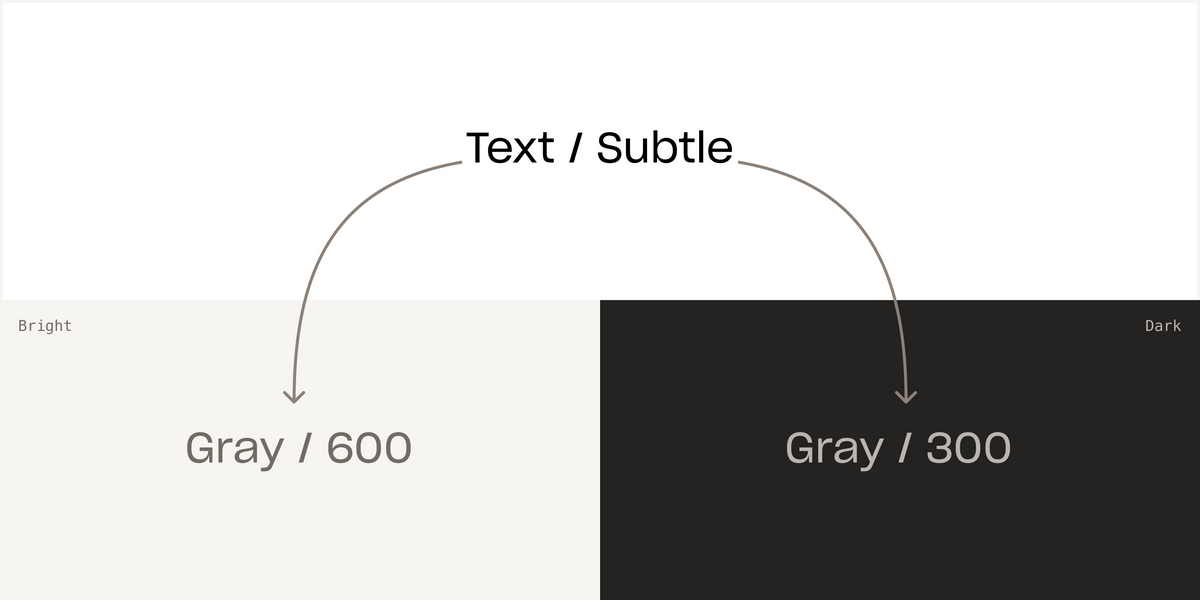
Before all the foundational scaling work, we already had a layer of semantic, role-based color tokens. The next step in this effort was to update the semantic tokens to provide straightforward, no-fuss support for theming and modes.
Color Groups
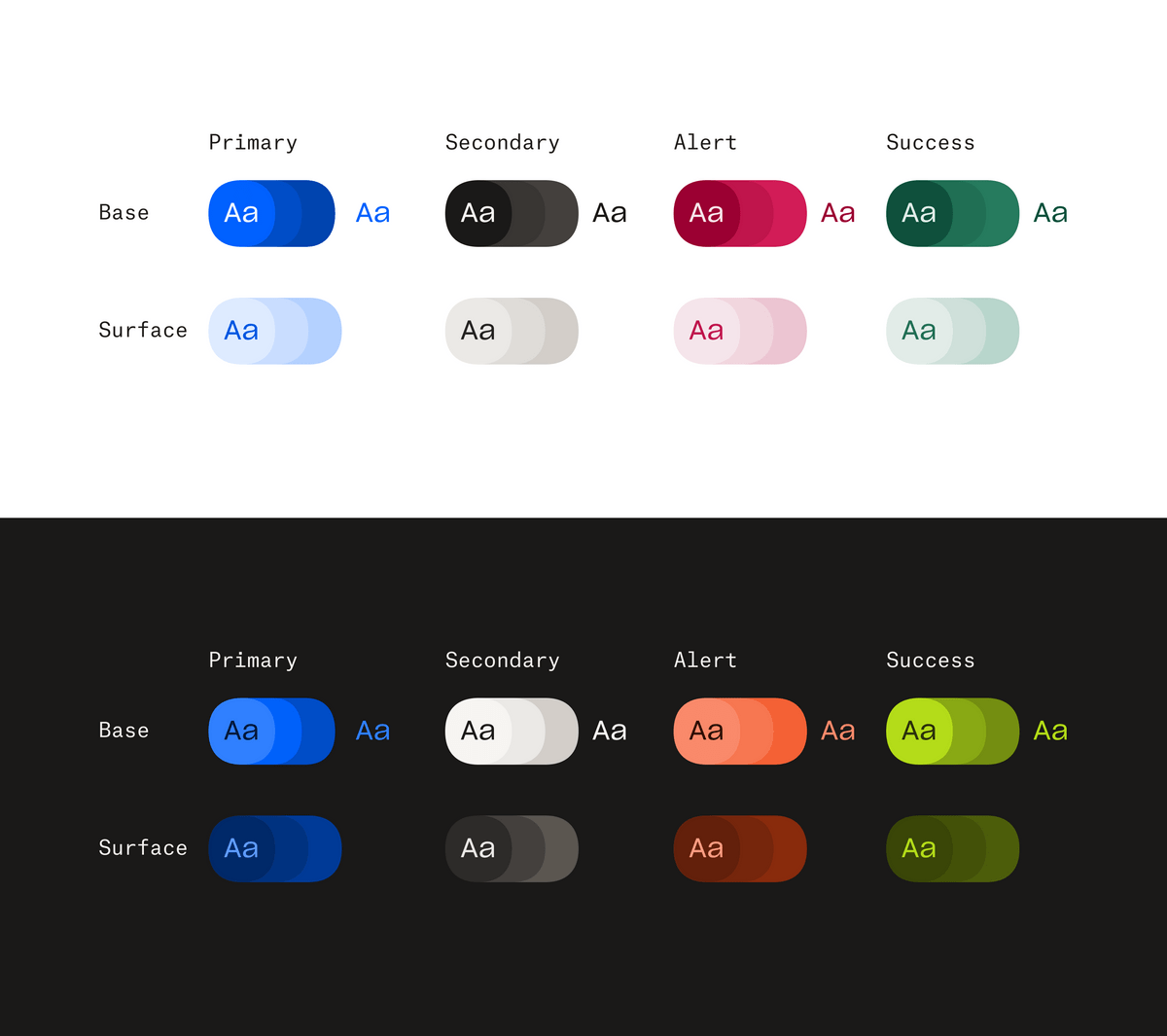
In order to simplify to semantic layer, we implemented some common concepts and terminology to make adoption and usage as straightforward as possible. Base and surface became useful distinctions between selected and deselected states. State modifiers provided support for hover and pressed states. Group names such as primary, secondary, alert, and success could then be tied to specific use cases and statuses.
Turnkey Theming
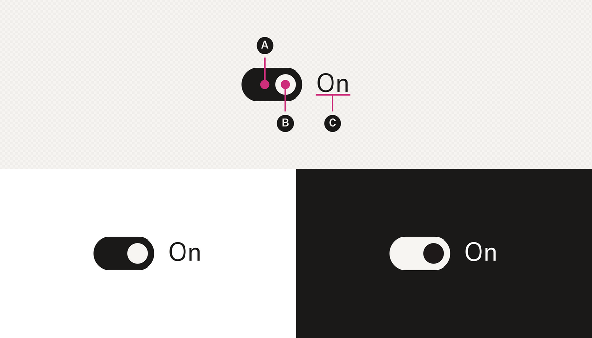
Previous attemps at theming and mode support had a nasty habit of requiring different semantic tokens to be applied per theme/mode. While this could be made to work, it created a lot of extra work without a lot of extra value. A goal of this effort became to guarantee that tokens could be applied once and theme or mode could be changed independently without causing contrast issues.
Mode and Elevation
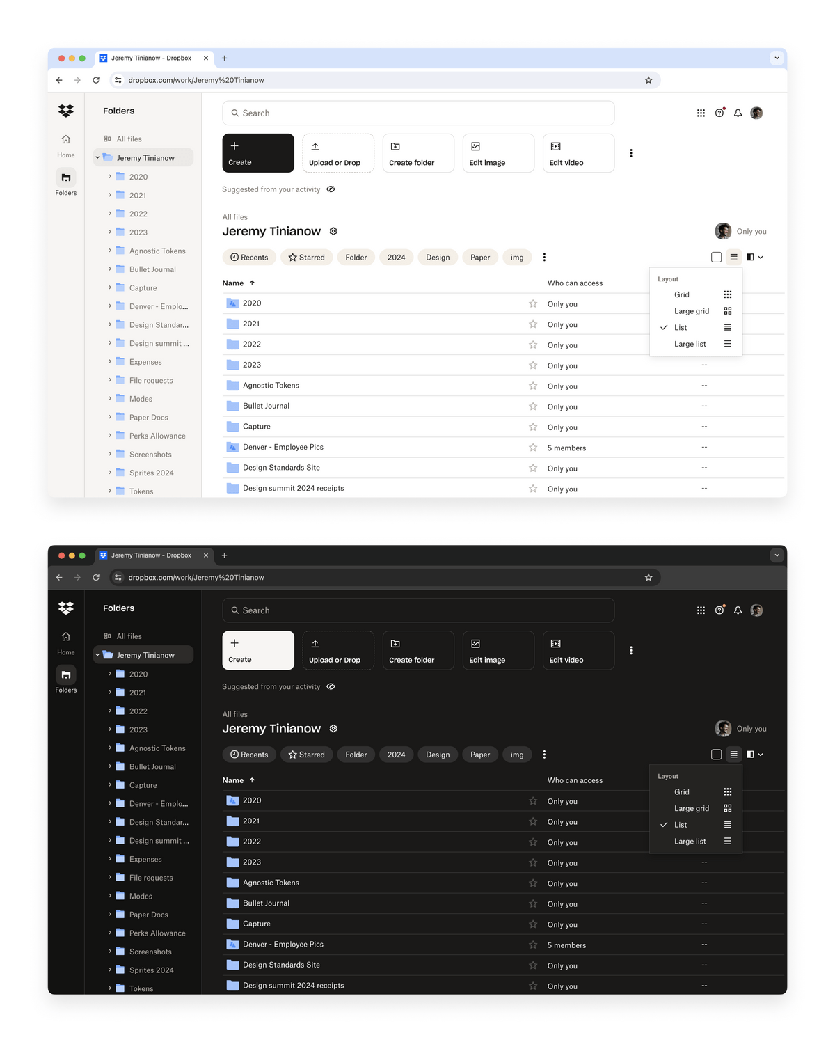
Prior to this effort, Dropbox didn't ship dark mode to web. Before wrapping the project, we reevaluated and established an approach to mode that would maintain elevation between bright and dark mode. This meant that any thing less elevated (further away from the global light source) would be darker, regardless of mode. This helps the interface feel consistent across modes.
Identity Colors
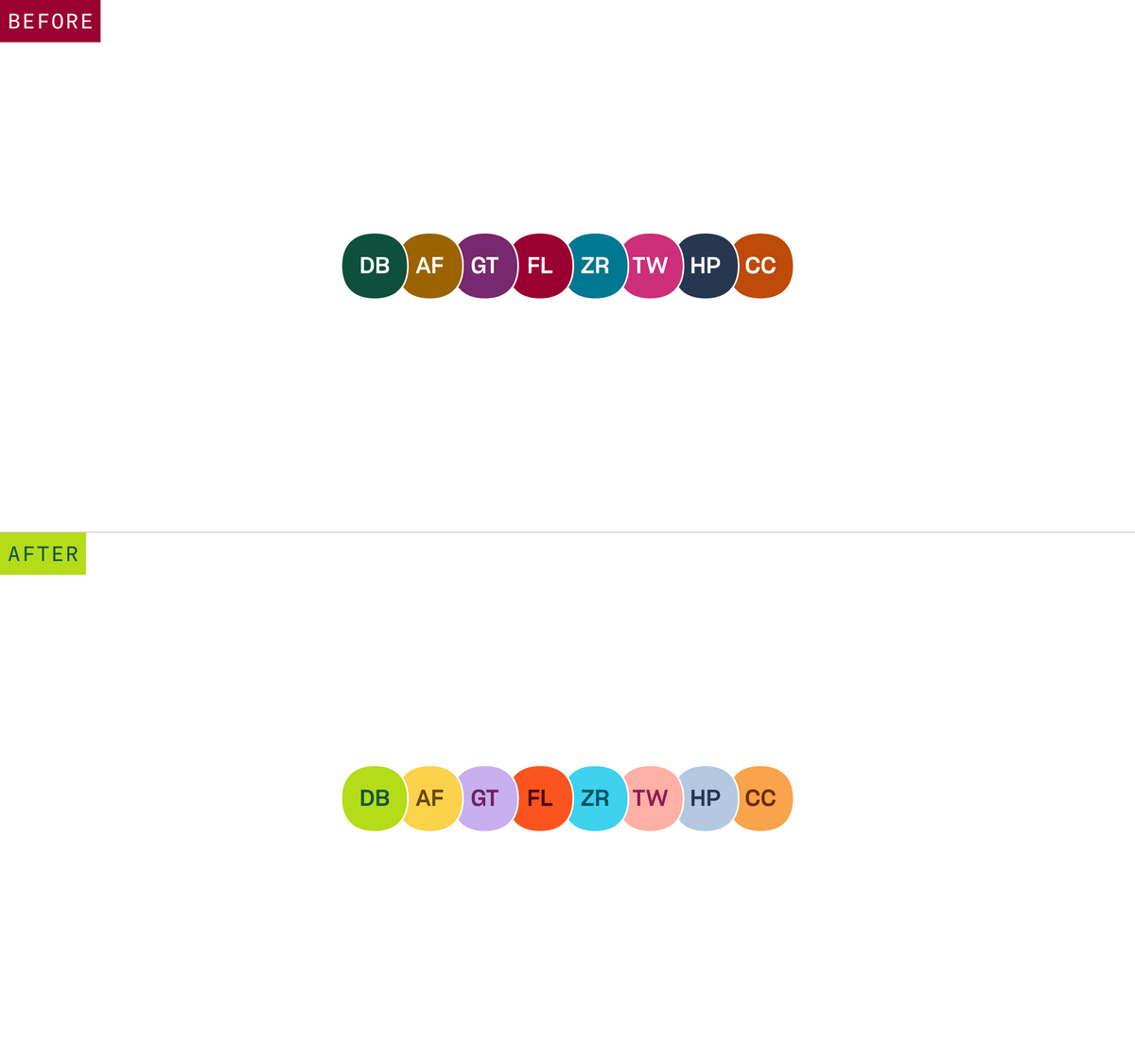
The tail end of this project dovetailed with a larger visual refresh effort. This presented a handful of opportunities to further fine tune our color system. Most Dropbox users don't upload a profile picture, so we saw placholder avatars and their identity colors as an opportunity to fine tune and inject a little more branded appearance into the product.
Results
The work I did on DIG colors unlocked several valuable results. First and foremost, this effort enabled a cross functional tiger team to ship dark mode support to dropbox.com — one of the most user requested features in recent years. The redefinition of the color system also improved the accessibility of Dropbox products, unlocked the foundation of a themeable component library, and enabled our design team to evolve the product suite without breaking down cohesiveness across it.
